Skala PR
Agency for classical music
Logo
Business cards
Web design
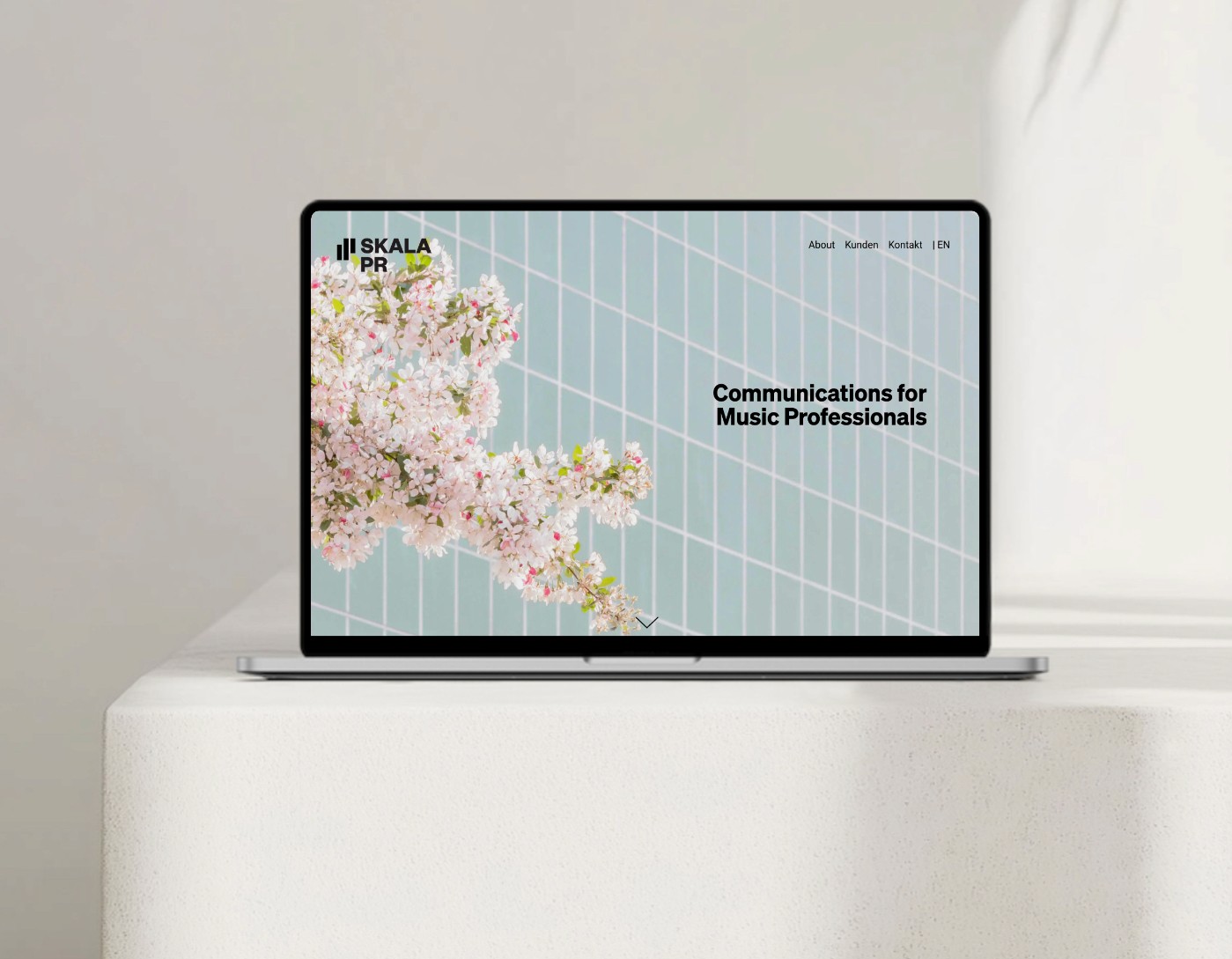
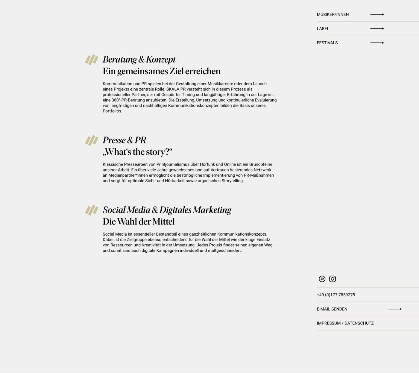
I developed the branding and web design for Skala-PR together with my partner Tobias Ruderer.
Since this was a new business launch, we based the brand design particularly thoroughly. In discussions with Birgit Niemeyer, it became clear that she wanted a strong brand that conveys reliability and success, but also warmth, without stealing the show from her artists and labels.
We decided on a very clear word-and-image mark, whose visual version can also be used as a hashtag.
The colors are reduced to black, white and gold — except for the hero image. To keep the overall feel from appearing too cool, we used serif and sans-serif typefaces in the lettering. This shows once again that it is usually worth investing in good typefaces. They simply look professional and high-quality.

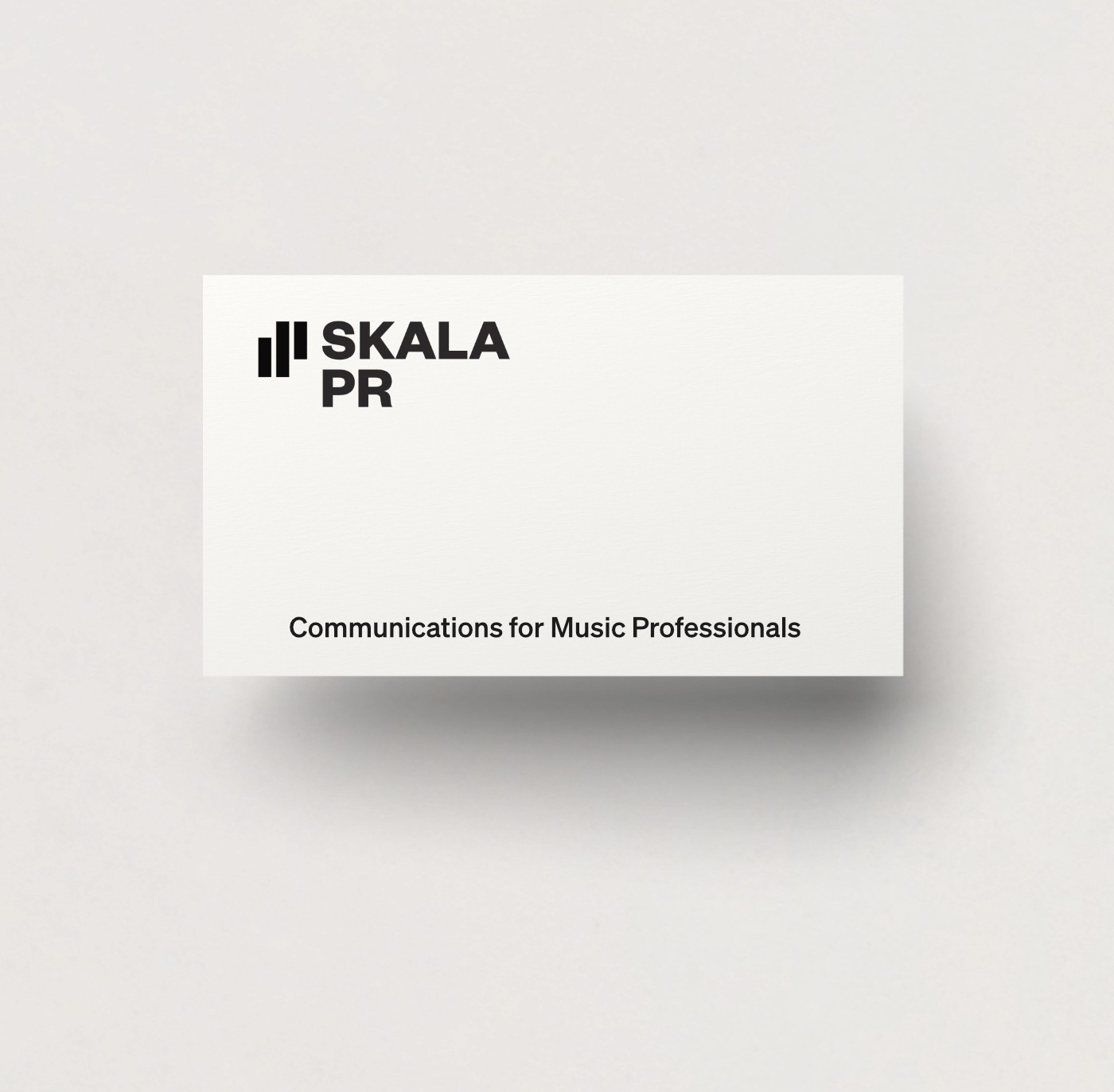
Logo on a business card






back